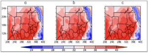
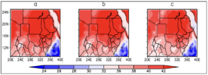
Downscaling Projections Maps and Figures Figure 19 Spatial comparison of the mean MAM Maximum temperature between the historical and RCP 4.5 scenario. The alphabetical letters represent a-historical 1971-2000, b- RCP4.5 2021-2050 and c-RCP 4.5 2051-2080
Downscaling Projections Maps and Figures Figure 18 Spatial comparison of the mean NDJF Maximum temperature between the historical and RCP 8.5 scenario. The alphabetical letters represent a-historical 1971-2000, b- RCP8.5 2021-2050 and c-RCP 8.5 2051-2080
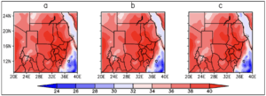
Downscaling Projections Maps and Figures Figure 17 Spatial comparison of the mean NDJF Maximum temperature between the historical and RCP 4.5 scenario. The alphabetical letters represent a-historical 1971-2000, b- RCP4.5 2021-2050 and c-RCP 4.5 2051-2080
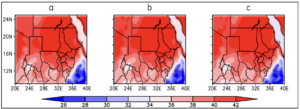
Downscaling Projections Maps and Figures Figure 16 Spatial comparison of the mean JJAS Maximum temperature between the historical and RCP 8.5 scenario. The alphabetical letters represent a-historical 1971-2000, b- RCP8.5 2021-2050 and c-RCP 8.5 2051-2080
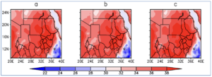
Downscaling Projections Maps and Figures Figure 15 Spatial comparison of the mean JJAS Maximum temperature between the historical and RCP 4.5 scenario. The alphabetical letters represent a-historical 1971-2000, b- RCP4.5 2021-2050 and c-RCP 4.5 2051-2080
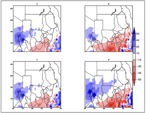
Downscaling Projections Maps and Figures Figure 14 Difference plot of Rainfall during the JJAS season. Shades of red indicate decrease in rainfall amount while shades of blue indicate increase in rainfall amount. The alphabetical letters represent a- difference between the baseline and RCP 4.5 2021-2050 period, b- difference between the baseline and RCP 4.5 2051-2080 period, c- difference between the baseline and RCP 8.5 2021-2050 period, d- difference between the baseline and RCP 8.5 2051-2080 period.
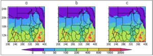
Downscaling Projections Maps and Figures Figure 13 Spatial comparison of the total mean JJAS rainfall between the historical and RCP 8.5 scenario. The alphabetical letters represent a-historical 1971-2000, b- RCP8.5 2021-2050 and c-RCP 8.5 2051-2080
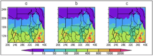
Downscaling Projections Maps and Figures Spatial comparison of the total mean JJAS rainfall between the historical and RCP 4.5 scenario. The alphabetical letters represent a-historical 1971-2000, b- RCP4.5 2021-2050 and c-RCP 4.5 2051-2080
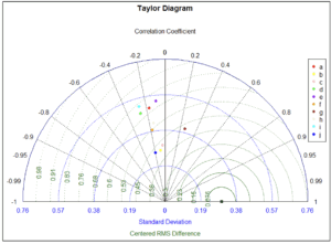
Downscaling Projections Maps and Figures Figure 11 Taylor diagram showing the validation Minimum temperature for the CORDEX RCA4 models against observed CRU data during the NDJF season. The alphabetical letters represent a-CCCma, b-CNRM, c-CSIRO, d-IPSL, e-MIROC, f-MOHC, g-MPI, h-NCC, i-NOAA and, j-Ensemble
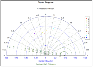
Downscaling Projections Maps and Figures Figure 10 Taylor diagram showing the validation Minimum temperature for the CORDEX RCA4 models against observed CRU data during the JJAS season. The alphabetical letters represent a-CCCma, b-CNRM, c-CSIRO, d-IPSL, e-MIROC, f-MOHC, g-MPI, h-NCC, i-NOAA and, j-Ensemble