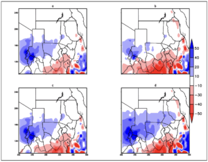
Downscaling Projections Maps and Figures Figure 29 Difference plot of Rainfall during the NDJF season. Shades of red indicate decrease in rainfall amount while shades of blue indicate increase in rainfall amount. The alphabetical letters represent a- difference between the baseline and RCP 4.5 2021-2050 period, b- difference between the baseline and RCP 4.5 2051-2080 period, c- difference between the baseline and RCP 8.5 2021-2050 period, d- difference between the baseline and RCP 8.5 2051-2080 period
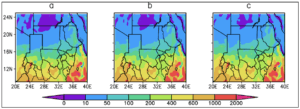
Downscaling Projections Maps and Figures Figure 28 Spatial comparison of the total mean NDJF rainfall between the historical and RCP 8.5 scenario. The alphabetical letters represent a-historical 1971-2000, b- RCP8.5 2021-2050 and c-RCP 8.5 2051-2080 period
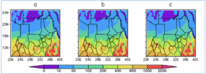
Downscaling Projections Maps and Figures Figure 27 Spatial comparison of the total mean NDJF rainfall between the historical and RCP 4.5 scenario. The alphabetical letters represent a-historical 1971-2000, b- RCP4.5 2021-2050 and c-RCP 4.5 2051-2080
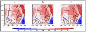
Downscaling Projections Maps and Figures Figure 26 Spatial comparison of the mean MAM Minimum temperature between the historical and RCP 8.5 scenario. The alphabetical letters represent a-historical 1971-2000, b- RCP8.5 2021-2050 and c-RCP 8.5 2051-2080
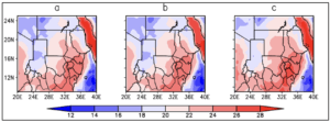
Downscaling Projections Maps and Figures Figure 25 Spatial comparison of the mean MAM Minimum temperature between the historical and RCP 8.5 scenario. The alphabetical letters represent a-historical 1971-2000, b- RCP8.5 2021-2050 and c-RCP 8.5 2051-2080
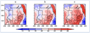
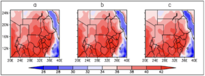
Downscaling Projections Maps and Figures Figure 24 Spatial comparison of the mean NDJF Minimum temperature between the historical and RCP 8.5 scenario. The alphabetical letters represent a-historical 1971-2000, b- RCP8.5 2021-2050 and c-RCP 8.5 2051-2080
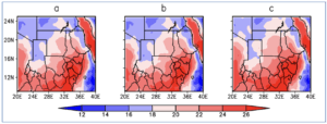
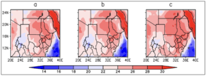
Downscaling Projections Maps and Figures Figure 23 Spatial comparison of the mean NDJF Minimum temperature between the historical and RCP 4.5 scenario. The alphabetical letters represent a-historical 1971-2000, b- RCP4.5 2021-2050 and c-RCP 4.5 2051-2080
Downscaling Projections Maps and Figures Figure 22 Spatial comparison of the mean JJAS Minimum temperature between the historical and RCP 8.5 scenario. The alphabetical letters represent a-historical 1971-2000, b- RCP8.5 2021-2050 and c-RCP 8.5 2051-2080
Downscaling Projections Maps and Figures Figure 21 Spatial comparison of the mean JJAS Minimum temperature between the historical and RCP 4.5 scenario. The alphabetical letters represent a-historical 1971-2000, b- RCP4.5 2021-2050 and c-RCP 4.5 2051-2080
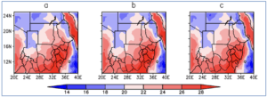
Downscaling Projections Maps and Figures Figure 20 Spatial comparison of the mean MAM Maximum temperature between the historical and RCP 8.5 scenario. The alphabetical letters represent a-historical 1971-2000, b- RCP8.5 2021-2050 and c-RCP 8.5 2051-2080