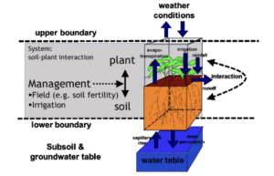
Crop Simulation Maps and Figures The part of the reality that is described by AquaCrop. AquaCrop Training Handbook. Book I: Understanding AquaCrop. https://www.fao.org/aquacrop/software/ aquacropstandardwindowsprogramme/en/#c522959
Crop Simulation Maps and Figures Figure 7 The total annual production of tomatoes in Sudan for the period 2012-2021
Crop Simulation Maps and Figures Figure 6 The total annual harvested areas and total annual production of onion in Sudan during the period 2011-2020
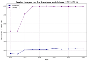
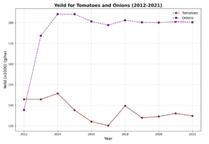
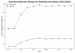
Crop Simulation Maps and Figures Figure 5 The total annual harvested areas and the total annual production of the vegetables grown in Sudan for the period 2012-2022. Source: FAOSTAT and Ministry of Agriculture and Forests, Sudan (2011 data)
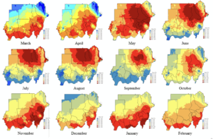
Crop Simulation Maps and Figures Figure 4 Sudan Monthly Climatology of Maximum Temperature over the period 1970-2000 in °C. Source: WorldClim v2.1 high resolution (~1km) data set (https://www.worldclim.org/data/index.html).
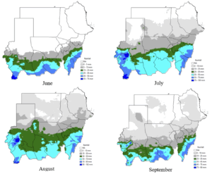
Crop Simulation Maps and Figures Figure 3 Distribution of the monthly rainfall (June, July, August and September) normal rainfall over the climatological period 1991-2020. Source: Climate Hazard Group InfraRed Precipitation with Satellite CHIRPS dataset (www.chc.ucsb.edu/products/CHIRPS-2.0/).
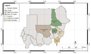
Crop Simulation Geographical locations of the ARC research station that used in the studies along with the crops and vegetables that planed in each one and used in this study
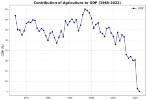
Crop Simulation Maps and Figures Contribution of agriculture to the Gross Domestic Product from 1965 through 2022. (Source: World Bank, 2022)