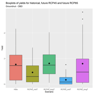
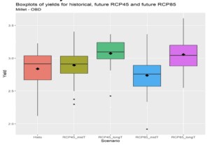
Crop Simulation Maps and Figures Figure 18 Distribution of modelled groundnut yields at El Obied for the historical period, for the mid-term future (2021-2050) and long-term future (2051-2080). Future yields are simulated for emission scenarios 4.5 and 8.5. The black point within the boxplot represents the mean value
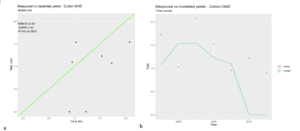
Crop Simulation Maps and Figures Figure 17 a) Scatter plot of the actual (historically measured) and modeled yield for Cotton at Ed Damazine research station. The x-axis represents observed yields (Yield_obs), and the y-axis represents modelled yields (Yield_mod). The green line represents the ideal 1:1 relationship) timeseries of measured (red dots) and. modelled (blue line) yields
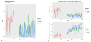
Crop Simulation Maps and Figures Figure 16 a) Time series of modeled Cotton yields at Ed Damazine for the historical period and future period (2021-2080) under the two scenarios RCP 4.5 and RCP 8.5. (b) time series of downscaled climate variables, for the same periods and the same scenarios. (Top) rainfall in mm & (bottom) Reference Evapotranspiration (ETo mm/day). Climate variables are averaged over the growing season. Red, green and blue colors depict the historical, RCP4.5 and RCP8.5 periods, respectively
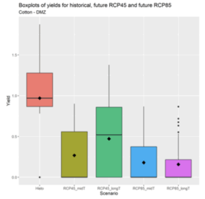
Crop Simulation Maps and Figures Figure 15 Distribution of modelled cotton yields at Ed Damazine of historical period (2005-2020), the mid-term future (2021-2050) and long-term future (2051-2080). Future yields are simulated for RCP4.5 and RCP8.5. The black point within the boxplot represents the mean value
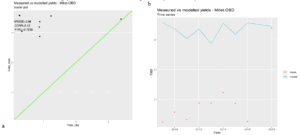
Crop Simulation Maps and Figures Figure 14 a) Scatter plot of the actual (historically measured) and modeled yield for Millet at El Obied research station. The x-axis represents observed yields (Yield_obs), and the y-axis represents modelled yields (Yield_mod). The green line represents the ideal 1:1 relationship) timeseries of measured (red dots) and. modelled (blue line) yields
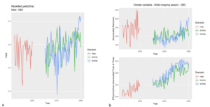
Crop Simulation Maps and Figures Figure 13 a) Time series of modeled Millet yields at El Obied for the historical period and future period (2021-2080) under the two scenarios RCP 4.5 and RCP 8.5. (b) time series of downscaled climate variables, for the same periods and the same scenarios. (Top) rainfall in mm & (bottom) Reference Evapotranspiration (ETo mm/day). Climate variables are averaged over the growing season. Red, green and blue colors depict the historical, RCP4.5 and RCP8.5 periods, respectively
Crop Simulation Maps and Figures Figure 12 Distributions of projections of future Millet yields under medium-term (RCP4.5_midT & RCP8.5_midT) and long-term (RCP4.5_longT and RCP8.5_longT) climate change scenarios for El Obied. Historical simulation is also shown in the boxplot graphs
Crop Simulation Maps and Figures Figure 11 a) Scatter plot of the actual (historically measured) and modeled yield for Sorghum at El Gedarif research station. The x-axis represents observed yields (Yield_obs), and the y-axis represents modelled yields (Yield_mod). The green line represents the ideal 1:1 relationship) timeseries of measured (red dots) and. modelled (blue line) yields
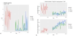
Crop Simulation Maps and Figures Figure 10 a) Time series of modeled Sorghum yields at El Gedarif for the historical period and future period (2021-2080) under the two scenarios RCP 4.5 and RCP 8.5. (b) time series of downscaled climate variables, for the same periods and the same scenarios. (Top) rainfall in mm & (bottom) Reference Evapotranspiration (ETo mm/day). Climate variables are averaged over the growing season. Red, green and blue colors depict the historical, RCP4.5 and RCP8.5 periods, respectively
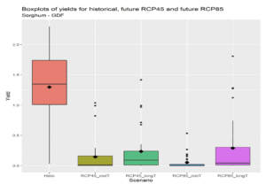
Crop Simulation Maps and Figures Figure 9 Distributions of projections of future Sorghum yields under medium-term (RCP4.5_midT & RCP8.5_midT) and long-term (RCP4.5_longT and RCP8.5_longT) climate change scenarios for Gedarif. Historical simulation is also shown in the boxplot graphs