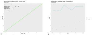
Crop Simulation Maps and Figures Figure 28 Scatter plot of the actual (historically measured) and modeled yield for Tomato at Shendi research station. The x-axis represents observed yields (Yield_obs), and the y-axis represents modelled yields (Yield_mod). The green line represents the ideal 1:1 relationship where modelled yields perfectly match observed yields
Crop Simulation Maps and Figures Figure 27 a) Scatter plot of the actual (historically measured) and modeled yield for Onion at Shendi research station. The x-axis represents observed yields (Yield_obs), and the y-axis represents modelled yields (Yield_mod). The green line represents the ideal 1:1 relationship where modelled yields perfectly match observed yields
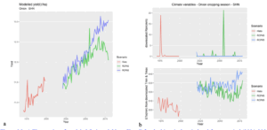
Crop Simulation Maps and Figures Figure 26 a) Time series of modeled Tomato yields at Shendi for the historical period and future period (2021-2080) under the two scenarios RCP 4.5 and RCP 8.5. (b) time series of downscaled climate variables, for the same periods and the same scenarios. (Top) rainfall in mm & (bottom) Reference Evapotranspiration (ETo mm/day). Climate variables are averaged over the growing season. Red, green and blue colors depict the historical, RCP4.5 and RCP8.5 periods, respectively
Crop Simulation Maps and Figures Figure 25 a) Time series of modeled Onion yields at Shendi for the historical period and future period (2021-2080) under the two scenarios RCP 4.5 and RCP 8.5. (b) time series of downscaled climate variables, for the same periods and the same scenarios. (Top) rainfall in mm & (bottom) Reference Evapotranspiration (ETo mm/day). Climate variables are averaged over the growing season. Red, green and blue colors depict the historical, RCP4.5 and RCP8.5 periods, respectively
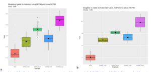
Crop Simulation Maps and Figures Figure 24 a) Distribution of historically measured and future modeled (RCP 4.5. and RCP 8.5 long and mid-term) yields for onion at Shendi Research Station. b) distribution of historically measured and future modeled (RCP 4.5. and RCP8.5 long and mid-term) yields for tomato at Shendi Research Station
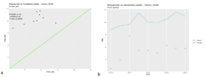
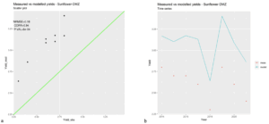
Crop Simulation Maps and Figures Figure 23 a) Scatter plot of the actual (historically measured) and modeled yield for Sunflower at Ed Damazine research station. The x-axis represents observed yields (Yield_obs), and the y-axis represents modelled yields (Yield_mod). The green line represents the ideal 1:1 relationship where modelled yields perfectly match observed yields
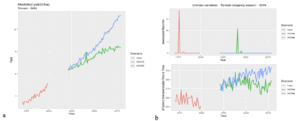
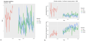
Crop Simulation Maps and Figures Figure 22 a) Time series of modeled Sunflower yields at Ed Damazine for the historical period and future period (2021-2080) under the two scenarios RCP 4.5 and RCP 8.5. (b) time series of downscaled climate variables, for the same periods and the same scenarios. (Top) rainfall in mm & (bottom) Reference Evapotranspiration (ETo mm/day). Climate variables are averaged over the growing season. Red, green and blue colors depict the historical, RCP4.5 and RCP8.5 periods, respectively
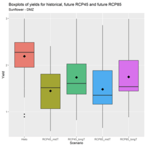
Crop Simulation Maps and Figures Figure 21 Boxplots of modelled sunflower yields at Ed Damazine for the historical period, for the mid-term future (2021-2050) and long-term future (2051-2080). Future yields are simulated for emission scenarios 4.5 and 8.5. The black point within the boxplot represents the mean value
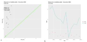
Crop Simulation Maps and Figures Figure 20 a) Scatter plot of the actual (historically measured) and modeled yield for Groundnut at El Obied research station. The x-axis represents observed yields (Yield_obs), and the y-axis represents modelled yields (Yield_mod). The green line represents the ideal 1:1 relationship where modelled yields perfectly match observed yields
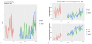
Crop Simulation Maps and Figures Figure 19 a) Time series of modeled Groundnut yields at El Obied for the historical period and future period (2021-2080) under the two scenarios RCP 4.5 and RCP 8.5. (b) time series of downscaled climate variables, for the same periods and the same scenarios. (Top) rainfall in mm & (bottom) Reference Evapotranspiration (ETo mm/day). Climate variables are averaged over the growing season. Red, green and blue colors depict the historical, RCP4.5 and RCP8.5 periods, respectively