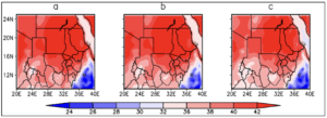
Figure 15 Spatial comparison of the mean JJAS Maximum temperature between the historical and RCP 4.5 scenario. The alphabetical letters represent a-historical 1971-2000, b- RCP4.5 2021-2050 and c-RCP 4.5 2051-2080
Figure 15 Spatial comparison of the mean JJAS Maximum temperature between the historical and RCP 4.5 scenario. The alphabetical letters represent a-historical 1971-2000, b- RCP4.5 2021-2050 and c-RCP 4.5 2051-2080