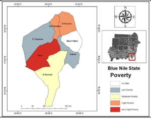
Maps and Figures Poverty Distribution and Hotspot Maps Fig 18a Poverty Distribution in Blue NileState The Blue Nile
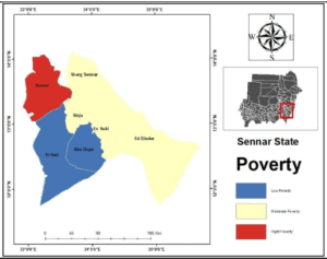
Maps and Figures Poverty Distribution and Hotspot Maps Fig 17a Poverty Distribution in Sennar State Sennar
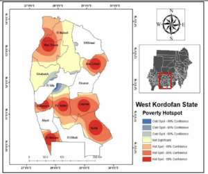
Maps and Figures Poverty Distribution and Hotspot Maps Fig 16b Poverty Hotspot Map in West Kordofan State West Kordofan
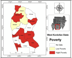
Maps and Figures Poverty Distribution and Hotspot Maps Fig 16a Poverty Distribution in West Kordofan State West Kordofan
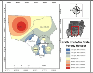
Maps and Figures Poverty Distribution and Hotspot Maps Fig 14b Poverty Hotspot Map in North Kordofan State North Kordofan
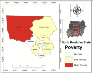
Maps and Figures Poverty Distribution and Hotspot Maps Fig 14a Poverty Distribution in North Kordofan State North Kordofan
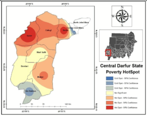
Maps and Figures Poverty Distribution and Hotspot Maps Fig 13b Poverty Hotspot Map in Central Darfur State Central Darfur
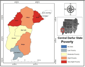
Maps and Figures Poverty Distribution and Hotspot Maps Fig 13a Poverty Distribution in Central Darfur State Central Darfur