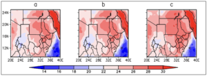
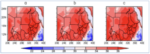
Downscaling Projections Maps and Figures Figure 25 Spatial comparison of the mean MAM Minimum temperature between the historical and RCP 8.5 scenario. The alphabetical letters represent a-historical 1971-2000, b- RCP8.5 2021-2050 and c-RCP 8.5 2051-2080
Downscaling Projections Maps and Figures Figure 24 Spatial comparison of the mean NDJF Minimum temperature between the historical and RCP 8.5 scenario. The alphabetical letters represent a-historical 1971-2000, b- RCP8.5 2021-2050 and c-RCP 8.5 2051-2080
Downscaling Projections Maps and Figures Figure 23 Spatial comparison of the mean NDJF Minimum temperature between the historical and RCP 4.5 scenario. The alphabetical letters represent a-historical 1971-2000, b- RCP4.5 2021-2050 and c-RCP 4.5 2051-2080
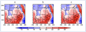
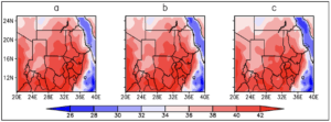
Downscaling Projections Maps and Figures Figure 22 Spatial comparison of the mean JJAS Minimum temperature between the historical and RCP 8.5 scenario. The alphabetical letters represent a-historical 1971-2000, b- RCP8.5 2021-2050 and c-RCP 8.5 2051-2080
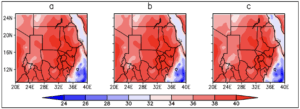
Downscaling Projections Maps and Figures Figure 21 Spatial comparison of the mean JJAS Minimum temperature between the historical and RCP 4.5 scenario. The alphabetical letters represent a-historical 1971-2000, b- RCP4.5 2021-2050 and c-RCP 4.5 2051-2080
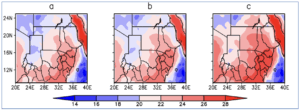
Downscaling Projections Maps and Figures Figure 20 Spatial comparison of the mean MAM Maximum temperature between the historical and RCP 8.5 scenario. The alphabetical letters represent a-historical 1971-2000, b- RCP8.5 2021-2050 and c-RCP 8.5 2051-2080
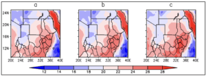
Downscaling Projections Maps and Figures Figure 19 Spatial comparison of the mean MAM Maximum temperature between the historical and RCP 4.5 scenario. The alphabetical letters represent a-historical 1971-2000, b- RCP4.5 2021-2050 and c-RCP 4.5 2051-2080
Downscaling Projections Maps and Figures Figure 18 Spatial comparison of the mean NDJF Maximum temperature between the historical and RCP 8.5 scenario. The alphabetical letters represent a-historical 1971-2000, b- RCP8.5 2021-2050 and c-RCP 8.5 2051-2080
Downscaling Projections Maps and Figures Figure 17 Spatial comparison of the mean NDJF Maximum temperature between the historical and RCP 4.5 scenario. The alphabetical letters represent a-historical 1971-2000, b- RCP4.5 2021-2050 and c-RCP 4.5 2051-2080
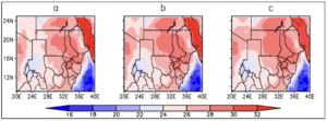
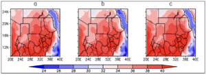
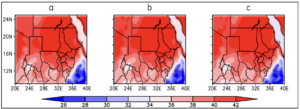
Downscaling Projections Maps and Figures Figure 16 Spatial comparison of the mean JJAS Maximum temperature between the historical and RCP 8.5 scenario. The alphabetical letters represent a-historical 1971-2000, b- RCP8.5 2021-2050 and c-RCP 8.5 2051-2080